How the prints are made
Flight path posters: how a day of real flights becomes a print
A flight path poster is a map of one airport's day, drawn from where its aircraft really flew: every line is one take-off, recorded by radio receivers on the ground. No two airports draw the same shape, and no two days at one airport are quite alike.
Updated 29 October 2026
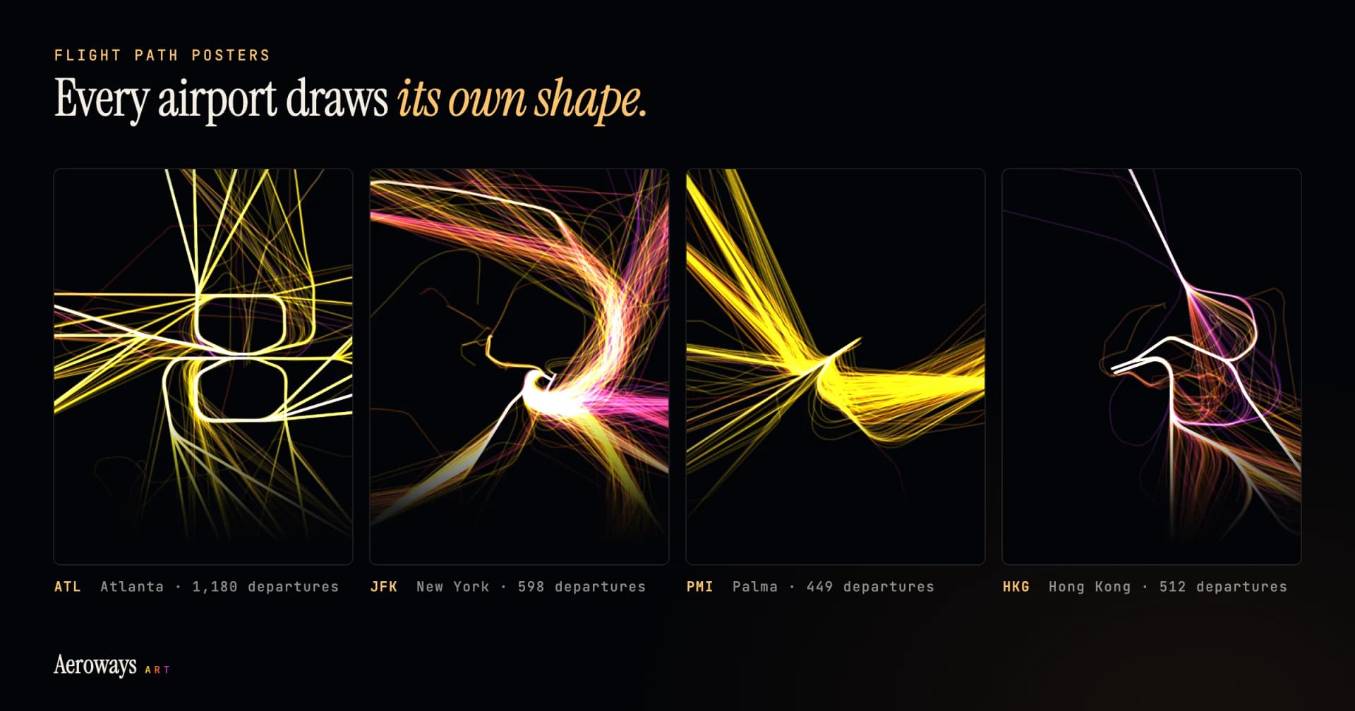
What a flight path poster shows
Take one airport and one day. Every aircraft that took off that day becomes one line, drawn from the runway along the path it really flew until it leaves the frame. Hundreds of lines on top of each other make the picture: Chicago O'Hare had 1,354 departures on 9 October 2026; Glasgow had 121 on 30 September.
Our posters run from midnight to midnight in the airport's own time zone. The frame is about 120 km from top to bottom, wide enough to show the routes spreading out and close enough to see the runways, and you can zoom it in or out when you make your print. Under the lines sit the airport's three-letter code, its city, the date and the number of departures. The code is the airport's IATA code, which often has little to do with the city's name.
Where the lines come from
Airliners broadcast their own position by radio, a system called ADS-B. The aircraft works out where it is by GPS and sends that, with its height and speed, about once a second. Air traffic control listens, and so can anyone with a receiver and an antenna. Volunteers around the world run receivers and share what they hear; our flights come from ADSB.lol, a community network that publishes its data openly under the Open Database License. Flight Noise explains the system in more depth in ADS-B explained.
A receiver only hears aircraft in its line of sight, so some places and some days are covered better than others, and FlyScout's guide to why flight trackers lose planes explains the gaps. We check every airport, every day, for gaps in what the receivers saw, and only the days seen well enough can be printed. A flight first heard well after it took off still counts in the number on the print, but it is left off the drawing, so no line starts in mid-air.
Why every airport draws its own shape
Four things decide the shape.
The runways. Every line starts at a runway, so the runways set the first strokes. Parallel runways send out parallel bundles; runways at angles to each other start a star.
The wind. Aircraft take off into the wind, which gets them airborne in a shorter run. When the wind turns, the airport turns its traffic round, and the lines leave from the other ends of the runways. At Heathrow the wind blows from the west most of the time, so on most days its take-offs head west. Flight Noise has more on why flight paths change with the wind.
The departure routes. Near the airport, aircraft follow published departure routes, known as SIDs, that take them from the runway to the airways, apart from each other and from the arrivals. Where hundreds of aircraft fly the same route, their lines add up until they glow white. Further out the routes split towards each destination, and the bundle fans out.
The map. An airport on an island or a coast sends most of its lines one way; a hub in the middle of a continent sends them everywhere. Mountains, restricted airspace and the traffic of neighbouring airports bend the routes too.
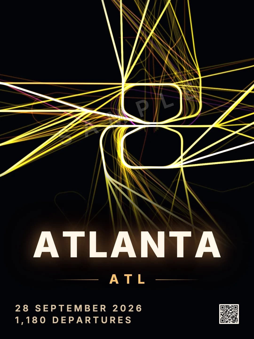
28 Sept 2026 · 1,180 departures
Straight spokes off parallel runways, and rounded loops where flights bound the other way turn back. Mostly yellow and orange: short flights.
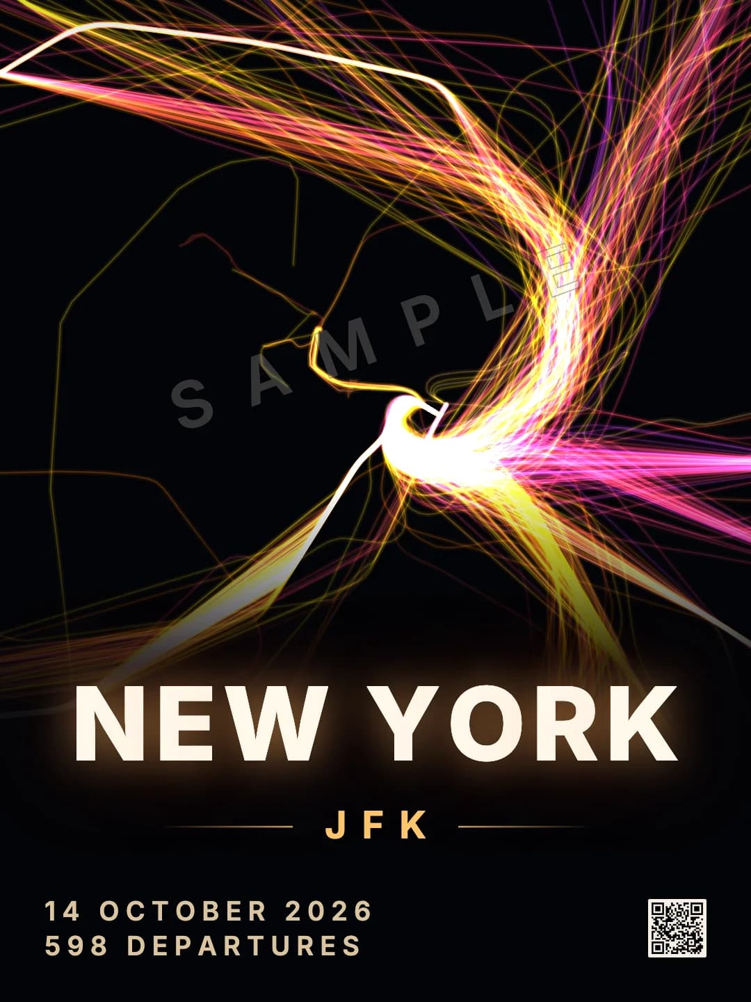
14 Oct 2026 · 598 departures
One sweeping hook as departures turn hard after take-off. The pink lines heading east are flights of four to eight hours, the length of a crossing to Europe.
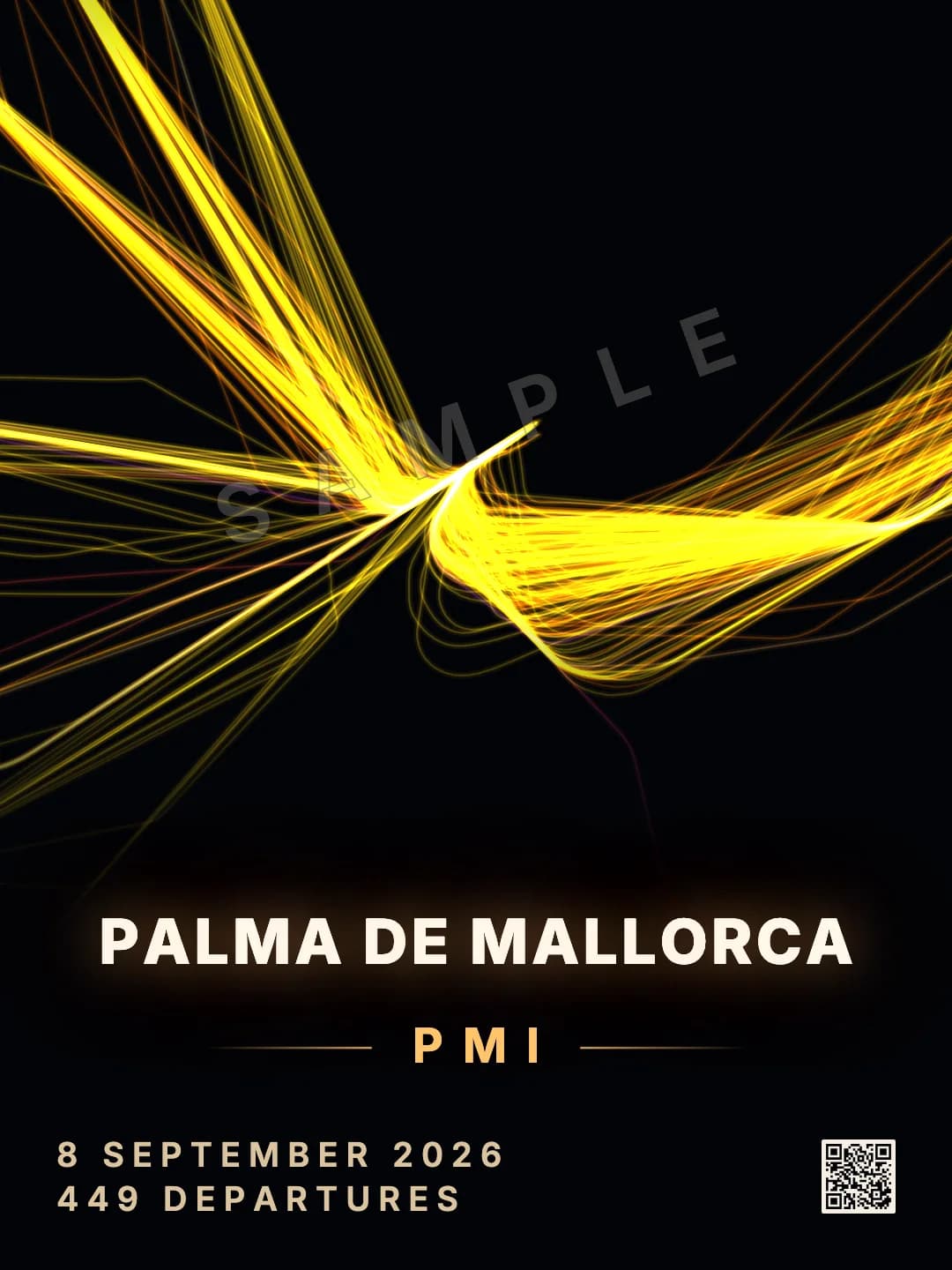
8 Sept 2026 · 449 departures
An island in late summer. Nearly every line is yellow: most of the day's flights were under two hours.
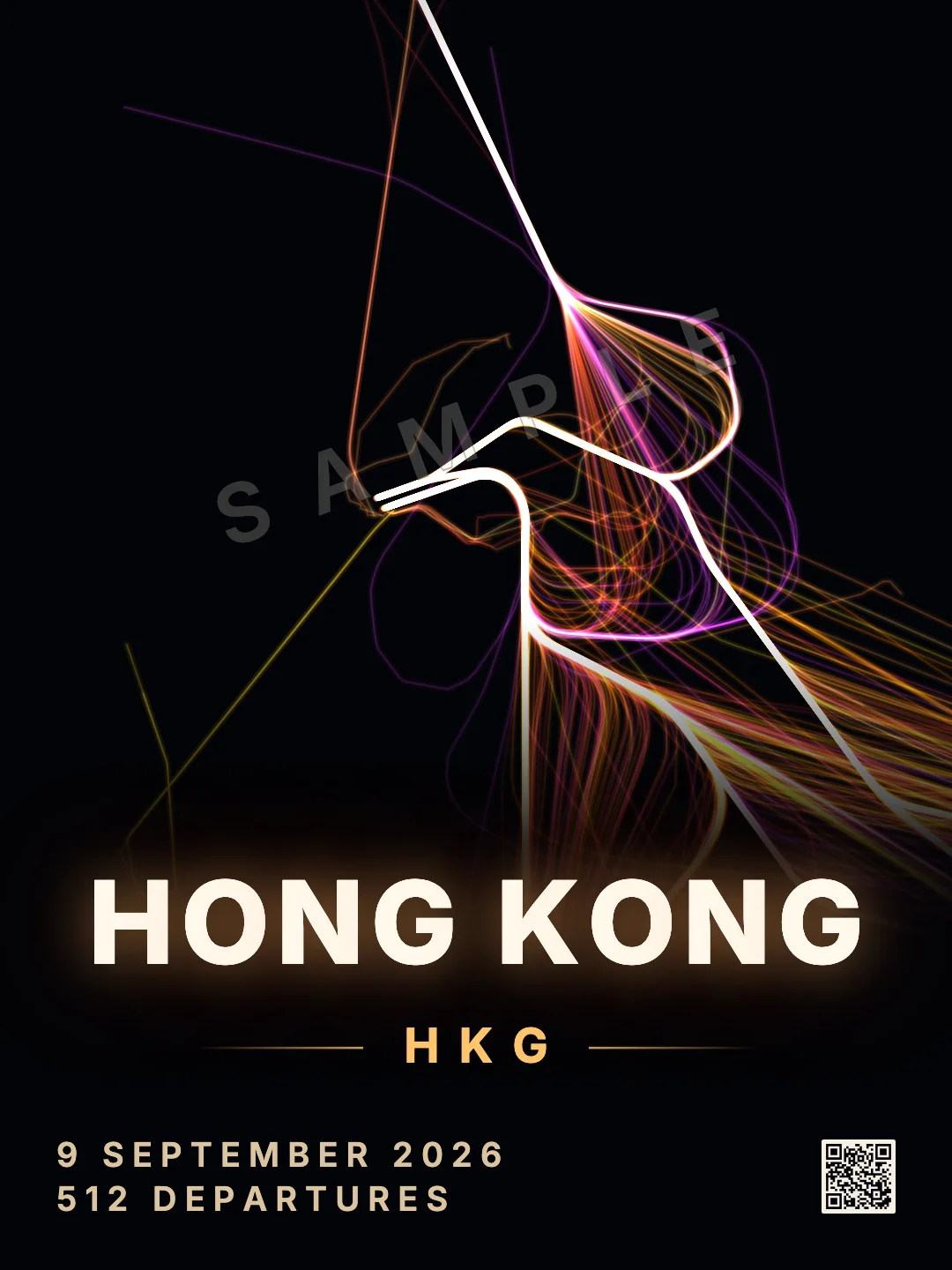
9 Sept 2026 · 512 departures
A few narrow corridors with tight turns, and more pink and purple than the others: many of the day's flights were longer than four hours.
What the colours mean
Each line is coloured by how long the flight lasted, from the take-off we saw to the landing we saw at the other end:
- Under 2 hours
- 2 to 4 hours
- 4 to 8 hours
- Longer
The colours show the shape of an airport's network. A holiday island in summer is almost all yellow; a hub with flights across oceans shows pink and purple. Where nobody's receiver heard a flight land, for example over an ocean or in a remote region, we cannot tell how long it lasted, and the line takes a warm colour from the time of day it took off instead.
Every day draws differently
The wind, the schedule and the season change the picture from one day to the next. A summer Saturday at a holiday airport is far busier than a winter Tuesday, and a day of easterly wind turns the whole drawing round. That is why we let you choose the day rather than sell one picture per airport.
The days go back to September 2025, at 385 airports. People choose a wedding day, the day they moved abroad, the day someone came home, or a last day at work at an airline's hub: our aviation gift ideas go through them. The date picker shows how well we saw each day, and you see the poster drawn before you buy.
From screen to wall
A pack has four print files, one for each common frame shape: 3:4 (45×60 cm, 18×24 in), 2:3 (60×90 cm, 24×36 in), the A sizes from A4 to A1, and 4:5 (40×50 cm, 16×20 in). Each is 6,000 pixels on its long side, 300 dpi at 50 cm; our guide to poster sizes and frames shows which file fits which frame. There is also a wallpaper for your phone and one for your desktop or TV.
Every print carries a small QR code in the corner. It leads to the day's own page, where the day replays flight by flight, so whoever sees the print on a wall can watch the sky it came from.
Questions
What is a flight path poster?
A print that draws where aircraft really flew. Ours take one airport and one local day, midnight to midnight, and draw every departure as a line from the runway outwards, with the airport's code, the date and the number of departures underneath.
Are the flight paths on the poster real?
Yes. Every line is one aircraft's recorded track, from the positions it broadcast by ADS-B and volunteers' receivers picked up. Nothing is averaged or filled in, and days the receivers saw only in part cannot be printed.
Can I show arrivals instead of departures?
Yes. A print shows departures unless you choose otherwise; you can pick arrivals, or both for the whole day in and out. The count under the airport's name changes to match.
Why does the same airport look different on different days?
Mostly the wind. Aircraft take off into the wind, so when it changes direction the airport turns its traffic round and the lines leave from the other ends of the runways. The day's schedule and the season change the picture too.
How big can I print it?
Each print file is 6,000 pixels on its long side, which is 300 dpi at 50 cm and sharp at poster sizes up to 60 × 90 cm. The pack has files for 3:4, 2:3, A-series and 4:5 frames, and wallpapers for a phone and a desktop.
Sources
Related guides
- Airports and flightsWhy airport codes don't match their cities: ORD, LAX, YYZ and more
- Printing and framingPoster sizes and frames: which size to print your poster
- Gifts with a datePersonalised aviation gifts: their airport, on a day that matters
- Airports and flightsThe world's busiest airports by flights, counted from a year of real flights